A wedding amongst the vines
We look back with warm memories at Laura’s sister’s wedding in St Tropez. The GG studio became wedding HQ and was tasked with making it a very special weekend for all to remember; Friday night, sunset cocktails overlooking the bay, Saturday, a Pampelonne beach party, and Sunday, the wedding, amongst the vines.
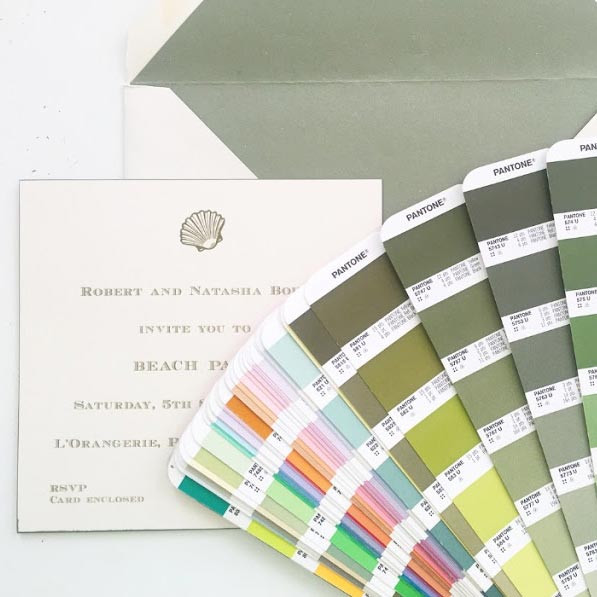
For the invitations, we thought an oyster card and olive green ink would fit perfectly. The envelopes were made from a thick oyster paper with a gorgeous olive green lining and had our calligrapher’s signature romantic writing on the front. It was tricky to work out whether to use olive green or black ink for the calligraphy but after several test runs, we found that black names and addresses were a good contrast to the olive text, and most definitely easier for the postman to read.
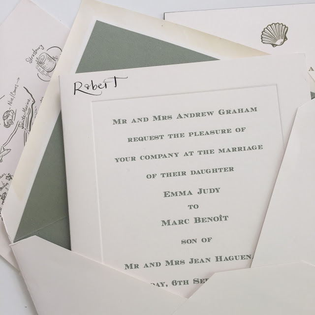
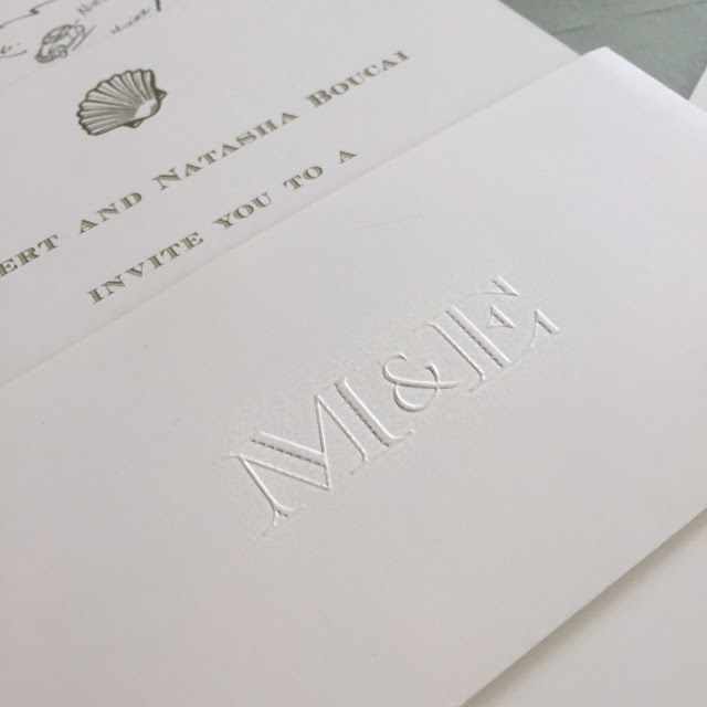
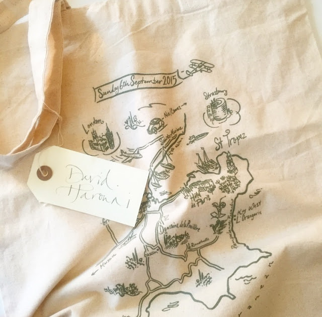
The invitation itself was a thick folded card with engraved text. We employ special techniques to ensure that the spine doesn’t crack on such a thick card and that there’s a strong indentation on the reverse of the card, and finish it off with a standard plate mark (the indented border). To hold the inserts, we created a little pocket with blind embossed initials of the engaged couple, and then a staggered effect for the information card, map and beach party invite. The reply cards were tucked into the back of the pocket. A lovely personal touch was the illustrated map. These are proving very popular with our clients at the moment.
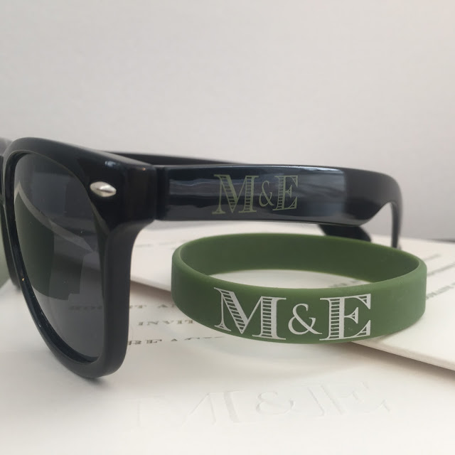
We screen printed the map onto canvas bags and filled them with a number of goodies to welcome the guests to their hotels: sunglasses and wristbands branded with the couple’s logo, welcome booklets and a number of French snacks. The finishing touch to the bags were the personalized tags.
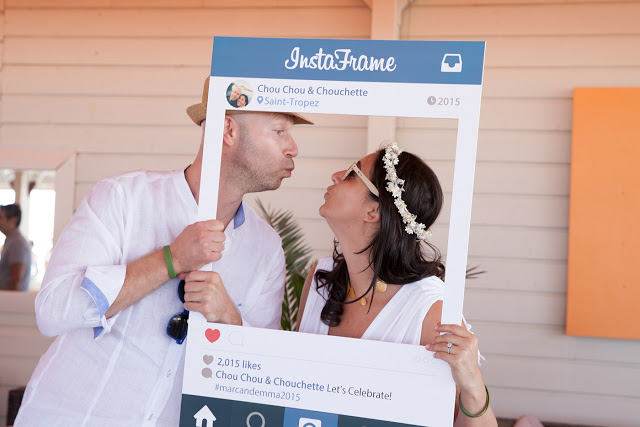
We had a couple of Instagram props made up for the beach party. Emblazoned on it was the hashtag #marcandemma2015 – guests could use the hashtag so that they could check out each other’s photos.
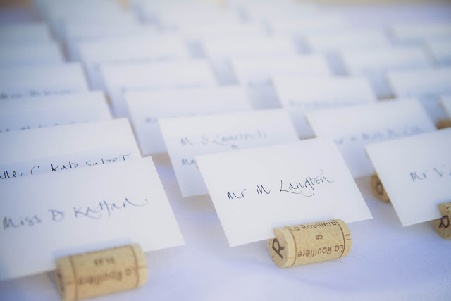
Another cute idea was placing the escort envelopes (the little cards which tell you which table you are sitting at) into corks. Inside the envelopes were cards referring to the table numbers. For the table numbers themselves, the calligrapher drew out large numbers in our olive green ink. For menus, we usually like to double them up as place cards. On a thick card, with a platemark and coloured edging, we detailed out the menu, and had the guest name written on the top.
It really was a special weekend and such fun to try out different ideas.